Design tokens
Published on 10-07-2025 by Ruben Sluijter
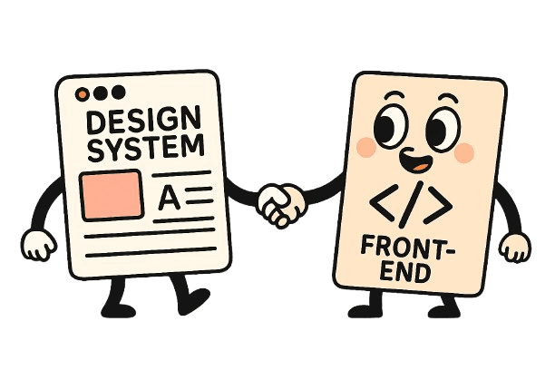
As a curious developer, I always try to learn and improve my craft. Over the last couple of weeks, I have been trying to broaden my horizons and learn more about designing good user interfaces. To do this, I purchased the well-known Refactoring UI by Adam Wathan & Steve Schoger and Practical UI by Adham Dannaway. In both of these books, it quickly became obvious what the power is of designing with a design system (a system which contains predefined styling options and usage guidelines). Having limitations on colors, spacing, and typography really makes a UI more coherent. In this blog, I will document how I integrated my design system directly into my front-end development and aim to demonstrate how this can benefit front-end developers.
Design tooling
While there is a lot of tooling available for creating your designs, for this demonstration we are limited to software that is capable of exporting “design tokens.” Most popular design tools like Figma and Adobe XD support design tokens, and within the UX-design space, working with tokens is becoming a lot more popular (see this Github community group). For this demonstration, I am using an app called Penpot, which is an open-source design tool.
Design tokens
If you have a design system in place, you have agreed upon a set of styling options for your user interface. These styling options/agreements can vary broadly, from a set of colors to typography to fixed spacing of elements. A design token is a representation of a single one of these styling agreements. Let’s take, for example, an h1 heading. A header like this could have multiple predefined styling agreements, and one of those agreements is definitely font size. So for this agreement, we can create a design token:

A token always has a name and a value; a description is optional, and based on your design tooling, extra fields could be added (in the case of Penpot, a “type” field is added).
Build for scale
Within your design tool, you can then apply these tokens to elements in your design.

In this screenshot, you can see I have a text called “Heading 1,” and to this text, three design tokens are applied: “heading.font.family”, “heading.1.size” and “font.weight.bold.” Now these design tokens can be reused for multiple elements. So “Heading 1”, “Heading 2” and “Heading 3” can all share the same “font.weight.bold” token. The power of using tokens this way is that it allows quick adjustments on multiple elements of your design. Whenever you update the “font.weight.bold” token, all headings will then also update. Using tokens throughout your design and your design system gives you the ability to quickly change all your components and elements. This can be very effective when, for example, you get a new client. Adjusting the design tokens with the stylesheet of your new client will change the look and feel of your user interface very quickly.
Single source of truth
Using design tokens inside your design tool already has benefits. But what really powers up your workflow is integrating these tokens into your front-end code. Linking these tokens directly to your CSS means updating the styling of your web application directly from your design tooling. No more handovers between designers and developers for styling changes—now the designer is directly in control of the look and feel of the website right from the design tool itself!
Integrating with front-end
But how do you communicate these tokens with your front-end? Yes, of course, JSON! The de facto way to share data between applications is JSON, so the first step is exporting your design tokens to JSON. Penpot has export to JSON built in, and the heading example from earlier gives this result:

From here, we need to use some magic (some code) to parse this JSON output and transform it to CSS variables that we can use in stylesheets. In my use case, I flatten the JSON and transform the above example to these CSS variables:

These CSS variables I then load from my global.css so I can use them in all my components. I also upload a raw dump of all my tokens on Storybook so I can always see what tokens are loaded.
Conclusion
In my experience, integrating design tokens into your UX and front-end workflow really powers up your capabilities. Designers can have a direct impact on the styling of components and even fix bugs without a developer needed. For now, I am still tweaking the code for transforming the JSON file to CSS variables, so if in the future you need some help, feel free to contact me!